

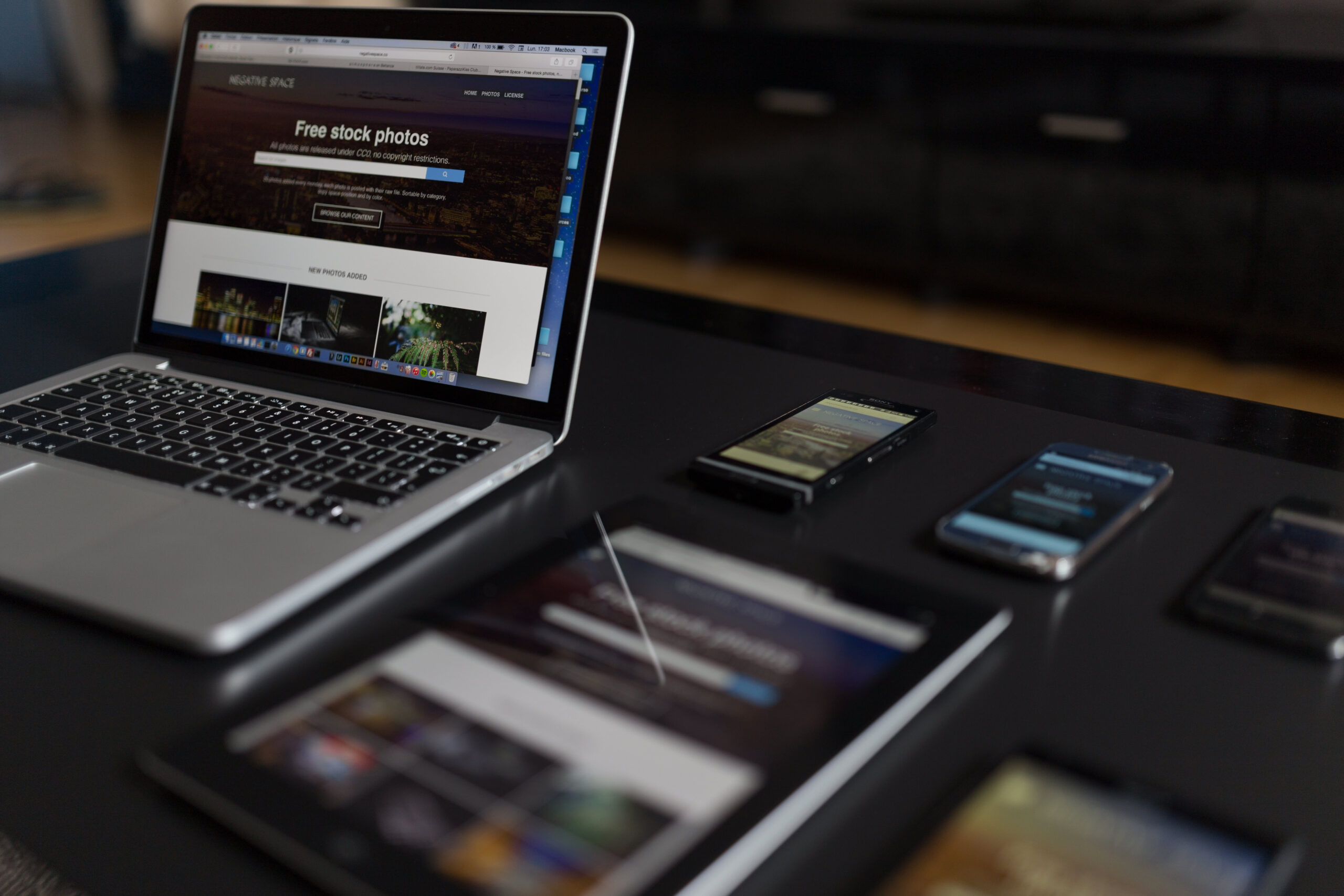
In today’s digital world, it’s more important than ever to ensure that your website looks and performs its best on all devices. As a business owner, you understand the value of providing your customers with an exceptional online experience, and responsive web design is key to achieving this goal. Pegas Technology Solutions, located in Waterville, Maine, specializes in helping businesses like yours create stunning websites that not only look great but also adapt seamlessly to various screen sizes and devices.
With our expertise in responsive web design principles and best practices, we’ll help you stay ahead of the curve as technology continues to evolve. Our team at Pegas Technology Solutions will work closely with you to develop a website that meets your unique needs while incorporating cutting-edge design techniques for optimal functionality across all platforms. So sit back and let us guide you through the process of building a website that truly stands out from the competition – one that reflects your brand identity while offering an unparalleled user experience for your customers.
Understanding the Importance of Responsive Web Design
So, you want to know why it’s essential to have a website that looks and works great on all devices, right? Well, the answer is simple: responsive web design is crucial for providing an optimal user experience. With more people accessing the internet on various devices like smartphones, tablets, laptops, and desktop computers, design accessibility has become a top priority. When your website can adapt seamlessly to different screen sizes and platforms, users will be able to navigate easily and find what they need without any frustration.
A well-designed responsive website not only improves the overall user experience but also helps boost your site’s search engine rankings. Google prioritizes mobile-friendly websites in their search results because they understand how important it is for users to access information quickly and efficiently. Furthermore, when your site follows best practices for responsiveness – such as optimizing images and using flexible grids – it loads faster and performs better across all devices. This ultimately leads to higher engagement rates from visitors who are more likely to stay longer on your site or make a purchase if they find it easy to use. So invest time in mastering responsive web design principles; both your audience and business will thank you for it!
Key Principles of Responsive Web Design
When diving into the key principles of responsive web design, you’ll want to focus on three essential components: fluid grids, flexible images, and CSS media queries. Fluid grids allow your website’s layout to adjust seamlessly across various screen sizes, while flexible images ensure that your visuals look great on any device. Lastly, harnessing the power of CSS media queries enables you to apply different styling rules based on specific conditions like device type or screen orientation, ultimately creating a user experience that is both attentive to detail and visually appealing.
Fluid Grids
Incorporating fluid grids into your site’s layout allows for seamless adaptation to various screen sizes, making it user-friendly and visually appealing across devices. Grid frameworks provide a solid foundation for creating responsive designs that adapt to different viewports, ensuring a consistent experience for users regardless of their device. Fluid grids utilize proportion-based scaling, which means that elements on the page resize in relation to one another rather than being set at fixed widths or heights. This helps address many of the responsive challenges faced by developers when designing sites that need to work well on screens ranging from small smartphones to large desktop monitors.
To better understand how fluid grids contribute to a successful responsive design, consider the following table showcasing four key benefits:
| Benefit | Description |
|---|---|
| Flexibility | Fluid grids allow content to adjust smoothly and automatically based on available screen space |
| Consistency | By using proportion-based scaling, fluid grids ensure a uniform appearance across devices |
| Efficiency | Implementing fluid grid layouts reduces code complexity and maintenance efforts due to automatic resizing |
| Accessibility | Users with varying screen sizes and resolutions can access your site without encountering display issues |
By incorporating fluid grids into your web design process, you’ll be able to create more adaptive layouts that cater to an increasingly diverse range of devices. Ultimately, this will enhance the overall user experience and help ensure your website remains accessible and visually appealing no matter what device it is viewed on.
Flexible Images
Moving on to flexible images, they’re essential for ensuring your site’s visuals adapt seamlessly across various devices and screen sizes, creating a smooth and engaging user experience. One of the critical components of responsive design is image scaling, which allows images to resize automatically based on the viewing device’s resolution. This not only enhances the overall appearance of your website but also prevents slow loading times often caused by unnecessarily large images. Another crucial aspect is using responsive icons that adjust their size and shape according to the available space, allowing them to maintain clarity and legibility even on smaller screens.
To implement flexible images effectively, you should consider several best practices. Firstly, use CSS techniques such as max-width property set to 100% so that images scale down proportionally when required without exceeding their original dimensions. Additionally, experiment with different file formats like SVGs for vector graphics or WebP for rasterized images – these can provide better compression rates while maintaining high visual quality compared to traditional formats like JPEG or PNG. Finally, don’t forget about accessibility: add appropriate alt text descriptions for all your visual content so that users with screen readers can still understand what the image represents. By following these guidelines, you’ll create a visually appealing website that performs well across various devices while also catering to diverse user needs.
CSS Media Queries
CSS media queries are like magic wands, allowing you to tailor your website’s layout and appearance for different devices and screen sizes with ease. Media query benefits include the ability to target specific device properties such as screen resolution, orientation, and even color preferences. By implementing these queries into your CSS code, you can ensure that users on various devices have a seamless browsing experience that is optimized for their device’s unique features.
To effectively utilize CSS media queries in your responsive web design efforts, it’s essential to understand how they work and what best practices should be followed. Query implementation starts by defining breakpoints within your stylesheets – these are essentially “points” at which certain styling rules will apply based on the user’s viewport size or other specified conditions. When creating breakpoints, think about the most common screen sizes and orientations in use today but also consider future-proofing your design by accommodating emerging technologies. Additionally, aim to keep your code clean and modular—this means using well-organized media queries alongside global styles so that any adjustments can be made quickly without disrupting the entire layout. Remember: flexibility is key when crafting beautiful responsive designs!
Best Practices for Creating Responsive Websites
To create top-notch sites that adapt seamlessly to various devices, it’s crucial to implement a few tried-and-true strategies. One of the most important aspects is using adaptive layouts, which allow your website to automatically adjust its content and design based on the screen size and resolution of the device being used. This ensures that your site will look great whether it’s viewed on a smartphone, tablet, or desktop computer. Additionally, utilizing responsive frameworks can simplify the process of creating a responsive site by providing pre-built components and grids for you to work with.
When designing your responsive website, pay close attention to typography and readability. Choose fonts that are easy to read across different devices and ensure the text sizes are appropriate for both desktop and mobile users. Another best practice is optimizing images so they load quickly without compromising quality; this can be achieved through techniques like compression and lazy loading. Finally, don’t forget about user experience (UX) – make sure your navigation is intuitive and tap targets are large enough for touchscreens. By following these best practices in combination with adaptive layouts and responsive frameworks, you’ll create an exceptional website that delights users no matter what device they’re using.
Testing and Optimization
Now that you’re familiar with the best practices for creating responsive websites, it’s essential to focus on testing and optimization to ensure your site performs seamlessly across various devices. Performance analysis and adopting a mobile-first approach are crucial factors in this phase.
Begin by conducting performance analysis to identify areas of improvement concerning load times, responsiveness, and overall user experience. Use tools like Google PageSpeed Insights or WebPageTest to assess your site’s loading speed and efficiency. Prioritize implementing a mobile-first approach in design, as more people access the internet via mobile devices than desktops nowadays. This means optimizing images, minimizing file sizes, and ensuring smooth navigability on smaller screens. Regularly test your website using various devices and screen resolutions during development to catch any issues early on. Remember that frequent testing and optimization will result in an efficient and enjoyable experience for all users – no matter what device they’re using!
The Role of Content in Responsive Web Design
In the realm of responsive web design, it’s crucial to consider readability and typography, prioritize content, and effectively use visual elements. To ensure your website is user-friendly across various devices, focus on selecting legible fonts and optimizing text size for easy reading. Additionally, organize your content in a way that highlights the most important information first while incorporating visually appealing graphics or images to enhance user engagement.
Readability and Typography
You’ve got mere seconds to capture your audience’s attention, so make sure your site’s readability and typography are top-notch! With the ever-evolving landscape of design, staying up-to-date with typography trends is essential for a successful website. Some popular trends include using bold typefaces, mixing serif and sans-serif fonts, and incorporating variable font technology. These approaches can help create an engaging visual hierarchy that guides users through your content effortlessly. Additionally, consider employing responsive typography techniques such as adjusting font size based on screen width or using viewport units to ensure excellent readability across all devices.
Readability enhancements should also be at the forefront of your design process. Focus on aspects like line spacing (leading), text contrast against backgrounds, optimal paragraph lengths (50-75 characters per line), and appropriate white space surrounding text elements for a comfortable reading experience. By paying close attention to these details, you’ll allow users to easily digest your content without straining their eyes or losing interest quickly. Remember that accessibility is not just about accommodating people with disabilities but also about ensuring everyone has a positive overall experience with your site – which ultimately translates into better engagement metrics and user satisfaction rates!
Prioritizing Content
Don’t underestimate the power of prioritizing content on your site, as it’s key to ensuring users find value and stay engaged with your offerings. Content organization and mobile prioritization are crucial factors in crafting a responsive web design that caters to the needs of your audience. By carefully organizing the content on your website and making sure it is easily accessible across all devices, you’ll not only improve user experience but also drive higher engagement rates from your visitors.
To prioritize content effectively, start by identifying the most important information or features you want users to see first. This can be done through analyzing user data, conducting surveys, or simply drawing from industry best practices. Once you’ve established these priority elements, ensure they’re prominently displayed on both desktop and mobile versions of your site. Additionally, consider using techniques like progressive disclosure or collapsible menus to make secondary information readily available without cluttering up the main interface. Ultimately, a well-structured and easy-to-navigate website will keep users coming back for more while showcasing what sets your business apart from competitors in Waterville Maine!
Use of Visual Elements
Harnessing the power of visuals can truly elevate your site’s appeal, so it’s essential to choose and utilize these elements thoughtfully for maximum impact. Establishing a clear visual hierarchy is crucial in guiding your users’ eyes through the content and ensuring they focus on the most important elements. This can be achieved using size, contrast, and proximity of various components within your design. Color schemes also play a vital role in creating an engaging user experience by evoking emotions, highlighting key information, or simply enhancing aesthetic appeal. In selecting colors for your website, consider factors such as brand identity, target audience preferences, accessibility requirements, and cultural associations.
In addition to visual hierarchy and color schemes, incorporating meaningful imagery like photos or illustrations that support your content will further strengthen its effectiveness. Choose images that are high-quality and relevant to ensure they complement rather than distract from your message. Additionally, use icons that are consistent in style throughout the site to create a cohesive look while aiding navigation for users who rely on visual cues. Lastly, consider implementing interactive elements like animations or video contents where appropriate; these can add depth to your design while increasing engagement levels among visitors. Remember that striking a balance between aesthetics and usability is key when designing with visuals – always keep user needs at the forefront of decisions when making creative choices for your responsive web design project.
Case Studies and Examples of Successful Responsive Web Designs
Let’s dive into some real-life examples of companies that have successfully implemented innovative and engaging designs, so you can see firsthand how these strategies work in action. One such example is Starbucks, which has made excellent use of adaptive layouts to provide a seamless user experience across multiple devices. By employing fluid grids and flexible images, the Starbucks website automatically adjusts its layout depending on the screen size and resolution of the device being used. This ensures that users can easily navigate through the site and access relevant content without any unnecessary scrolling or zooming.
Another great example of successful responsive web design is The Boston Globe’s website. Recognizing the importance of device compatibility, The Boston Globe invested in creating a website that works seamlessly across various platforms – from desktops to smartphones to tablets. They achieved this by incorporating media queries, flexible images, and fluid grids into their design framework. As a result, users can now access a consistent browsing experience irrespective of their device type or screen size while enjoying fast-loading pages with visually appealing content tailored specifically for each platform. These two case studies demonstrate just how effective responsive web design principles can be when applied correctly – leading to increased user satisfaction and ultimately driving business success.
Frequently Asked Questions
How does responsive web design impact search engine optimization (SEO)?
Responsive web design significantly impacts your website’s search engine optimization (SEO) by catering to Google’s mobile-first indexing approach and providing a user experience boost for your visitors. By implementing a responsive design, you ensure that your website seamlessly adapts to various screen sizes and devices, offering an optimal viewing experience for users. This not only enhances the overall usability but also signals to search engines that your site is user-friendly, potentially improving its organic ranking. Moreover, with Google prioritizing mobile-optimized websites in search results, having a responsive design becomes crucial in maintaining a competitive edge in today’s digital landscape. So, make sure to invest in responsive web design to enhance both SEO performance and user satisfaction on your site.
What are the common challenges faced while implementing responsive web design and how can they be overcome?
When implementing responsive web design, you may face several challenges, but overcoming them is possible with the right strategies. Some common obstacles include handling complex navigation menus, dealing with varying image sizes and resolutions, maintaining website performance and load times, ensuring cross-browser compatibility, and managing content hierarchy. To tackle these issues effectively, focus on simplifying your site’s navigation structure for easy access on all devices, optimizing images to be flexible and retina-ready using CSS techniques or tools like Picturefill.js, prioritizing website speed by minifying code and utilizing caching methods, testing your site in multiple browsers to iron out inconsistencies using tools such as BrowserStack or CrossBrowserTesting.com , and carefully planning your content layout so it adapts seamlessly across various screen sizes. With careful attention to detail and a creative approach to problem-solving, you can successfully overcome these challenges in your responsive implementation.
Are there any specific industries or types of businesses that benefit more from responsive web design?
No matter the industry, your business can reap significant benefits from adopting responsive web design. It’s essential to recognize that certain industries may experience more immediate advantages, such as e-commerce, hospitality, and service-based businesses. These sectors rely heavily on providing an optimal user experience across multiple devices to drive sales and customer satisfaction. Implementing a responsive web design allows for greater business adaptability, ensuring you stay ahead of the competition by catering to diverse user needs and offering seamless interactions with your brand online. Don’t miss out on the opportunity to harness these industry-specific benefits – make sure your website is designed with responsiveness in mind!
How can responsive web design be integrated with other web development frameworks and technologies?
Integrating responsive web design with other web development frameworks and technologies is a breeze, thanks to its framework compatibility. To ensure seamless responsive integration, opt for popular front-end frameworks like Bootstrap or Foundation that are built specifically for creating mobile-first and responsive designs. Additionally, you can take advantage of CSS preprocessors like SASS or LESS to streamline the creation of modular and maintainable style sheets. Don’t forget to incorporate JavaScript libraries such as jQuery or React that aid in crafting device-agnostic user experiences. Remember, blending these tools effectively will enable your website to adapt effortlessly across various devices and screen sizes, delivering an exceptional browsing experience for your users.
What are the cost implications of implementing responsive web design compared to traditional web design methods?
When considering the cost implications of implementing responsive web design compared to traditional web design methods, it’s important to conduct a thorough cost evaluation. While there may be initial investment required for responsive design, it’s often more cost-effective in the long run due to its ability to adapt seamlessly across various devices and screen sizes, eliminating the need for separate mobile and desktop designs. Traditional design drawbacks include higher maintenance costs, potential loss of customers due to poor user experience on certain devices, and ongoing updates as technology evolves. By embracing responsive web design from the start, you’ll not only save time and money but also ensure your website is accessible and user-friendly for all visitors regardless of their device or screen size.
Conclusion
In conclusion, mastering responsive web design is essential for your website’s success. As you delve into the key principles and best practices, remember to keep your users in mind and prioritize their experience.
Don’t forget that content plays a crucial role in responsive design too. By combining all these elements effectively, you’ll create a site that not only looks great but also performs seamlessly across devices – ensuring happy, engaged visitors!


